Best Website Design: What Makes a Website Stand Out?
The best website design does more than look attractive. It helps visitors quickly understand what a business offers, find the information they need, and take the next step with confidence. Whether you are building a personal portfolio, an online store, or a business website, thoughtful design can make the experience clearer and more enjoyable.
What Is Good Website Design?
Good website design combines visual appeal with usability. A well-designed site feels consistent, loads smoothly, works across devices, and makes important information easy to find. It also reflects the organization’s identity and supports the goals of both the business and its visitors.
There is no single design that is best for every website. The right approach depends on your audience, content, and purpose. A portfolio may benefit from bold imagery, while a service business may need clear explanations and prominent contact options.
Essential Elements of the Best Website Design
Clear Navigation
Visitors should be able to move around your website without guessing. Use a simple menu with descriptive labels, organize related pages together, and make key information—such as services, pricing, or contact details—easy to reach. On mobile devices, menus should be easy to open and use.
Responsive Layout
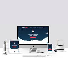
A responsive website adjusts to different screen sizes, including phones, tablets, and desktop computers. Text should remain readable, images should fit the screen, and buttons should be comfortable to tap. Test important pages on multiple devices rather than relying on how they look on a single screen.
Strong Visual Hierarchy
Visual hierarchy guides visitors through a page. Use headings, spacing, color, and size to show which information matters most. A clear page structure helps people scan content and understand what to do next.
Readable Typography
Choose fonts that are easy to read and use them consistently. Body text should have comfortable sizing and spacing, while headings should make the page structure clear. Avoid using too many typefaces or relying on decorative fonts for long passages.
Purposeful Color and Imagery
Colors and images help create a recognizable identity, but they should support the content rather than distract from it. Choose a limited color palette, maintain sufficient contrast, and use relevant, high-quality images. Descriptive alternative text can make images more accessible to people using assistive technology.
Fast Loading and Smooth Performance
Slow pages can frustrate visitors. Optimize image sizes, limit unnecessary effects, and use reliable hosting. Check performance regularly, especially after adding new plugins, scripts, or media.
Accessible Experiences
Accessibility helps more people use your website. Use meaningful headings, provide text alternatives for important images, make sure the site can be navigated with a keyboard, and choose colors with enough contrast. Forms should have clear labels and helpful error messages.
Clear Calls to Action
Every important page should make the next step clear. Depending on your goal, that might mean contacting your team, booking an appointment, subscribing to a newsletter, or making a purchase. Use concise button text, such as “Get a Quote” or “Shop Now,” and place calls to action where visitors can find them naturally.
Website Design Mistakes to Avoid
- Overcrowded pages: Too many elements compete for attention and make content difficult to scan.
- Unclear messaging: Visitors should be able to understand what you offer without searching through multiple pages.
- Hard-to-use mobile layouts: Small text, tiny buttons, and horizontal scrolling can make mobile browsing frustrating.
- Inconsistent styling: Different colors, fonts, and button styles can make a site feel confusing or unfinished.
- Autoplaying media: Unexpected sound or motion can interrupt visitors and create accessibility issues.
- Neglected content: Outdated details can reduce trust, even when the design looks polished.
How to Choose the Right Website Design
Start by identifying your website’s main purpose and audience. Decide what visitors should be able to do, then organize the pages and content around those needs. Review examples from your industry for inspiration, but avoid copying a design that does not fit your brand or goals.
Before launch, test the website with real users if possible. Ask them to find key information or complete a task, and pay attention to where they hesitate. After launch, use visitor feedback and performance data to guide improvements.
Final Thoughts
The best website design is attractive, easy to use, accessible, and aligned with its purpose. A clear structure, responsive layout, readable content, and straightforward next steps can create a better experience for visitors and support your organization’s goals. Treat design as an ongoing process: review your site regularly and improve it as your audience and needs change.
Top 5 Essential Tips for Effective Website Design
- Keep navigation simple and clear.
- Use readable fonts and strong contrast.
- Design for mobile screens first.
- Make pages load quickly.
- Use consistent colors and spacing.
Keep navigation simple and clear.
Keep your website navigation simple and clear so visitors can find what they need without confusion. Use familiar, descriptive labels, organize related pages into a logical menu, and highlight the most important sections. A straightforward navigation system helps people move through your site with confidence, whether they’re browsing on a desktop or a mobile device.
Use readable fonts and strong contrast.
Use readable fonts and strong contrast to make your website comfortable for everyone to use. Choose simple typefaces, keep body text large enough to read on mobile and desktop screens, and leave plenty of space between lines. Make sure text stands out clearly from its background—for example, dark text on a light background—and don’t rely on color alone to communicate important information. These choices help visitors scan your content, find what they need, and enjoy a more accessible experience.
Design for mobile screens first.
Designing for mobile screens first helps ensure your website works well where many visitors are browsing: on their phones. Start with essential content, simple navigation, readable text, and buttons that are easy to tap on a small screen. Then adapt the layout for tablets and desktops, adding space and larger-screen features where they make sense. This mobile-first approach keeps your site focused, accessible, and comfortable to use across devices.
Make pages load quickly.
Make pages load quickly to keep visitors engaged and make your website easier to use. Compress images, remove unnecessary scripts and plugins, and choose reliable web hosting to reduce loading times. A fast website creates a smoother experience, especially for people browsing on mobile devices or slower connections.
Use consistent colors and spacing.
Use consistent colors and spacing to make your website feel polished and easy to navigate. Choose a small color palette that reflects your brand, and apply it consistently to headings, buttons, links, and backgrounds. Keep spacing between sections and elements predictable so visitors can scan the page comfortably and understand how different pieces of content relate. A consistent visual style helps your site feel cohesive while keeping attention on the information that matters.