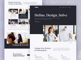
The Importance of Responsive Design in Today’s Digital World
In a world where people access websites on various devices, responsive design has become more important than ever. Responsive design refers to a website’s ability to adapt and provide an optimal viewing experience across different screen sizes and devices, such as desktops, laptops, tablets, and smartphones.
With the increasing use of mobile devices to browse the internet, having a responsive website is crucial for businesses to reach their target audience effectively. A responsive design ensures that your website looks great and functions well regardless of the device being used, leading to better user experience and engagement.
Moreover, search engines like Google prioritize mobile-friendly websites in their search results. Websites that are not responsive may be penalized in search rankings, making it harder for users to find them online. By implementing responsive design, businesses can improve their visibility and attract more organic traffic to their websites.
Responsive design also streamlines the maintenance process for website owners. Instead of managing separate desktop and mobile versions of a site, a responsive design allows for consistent updates across all devices, saving time and resources in the long run.
In conclusion, responsive design is no longer just a trend but a necessity in today’s digital landscape. Businesses that invest in creating responsive websites will benefit from increased traffic, improved user experience, higher search engine rankings, and overall success in the competitive online market.
Top 5 Tips for Effective Responsive Design: Enhancing User Experience Across All Devices
- Prioritize mobile-first design to ensure a good user experience on smaller screens.
- Use media queries to adjust the layout based on different screen sizes and resolutions.
- Optimize images and videos for faster loading times on mobile devices.
- Ensure touch-friendly navigation elements for easy interaction on touchscreens.
- Test your website across various devices and browsers to ensure consistent performance.
Prioritize mobile-first design to ensure a good user experience on smaller screens.
To ensure a positive user experience on smaller screens, it is essential to prioritize mobile-first design in responsive design strategies. By starting the design process with a focus on mobile devices, websites can be optimized for smaller screens and touch interactions, leading to improved usability and engagement for mobile users. This approach not only enhances the overall user experience but also aligns with the increasing trend of mobile browsing, helping businesses reach and connect with their audience effectively across different devices.
Use media queries to adjust the layout based on different screen sizes and resolutions.
To ensure a seamless user experience across various devices, it is essential to utilize media queries in responsive design. By incorporating media queries, web developers can adjust the layout of a website based on different screen sizes and resolutions. This allows for a flexible and adaptive design that responds to the user’s device, providing optimal viewing and functionality. Media queries enable websites to display content in a visually appealing manner while maintaining usability on devices ranging from desktops to smartphones, enhancing overall accessibility and user satisfaction.
Optimize images and videos for faster loading times on mobile devices.
Optimizing images and videos is a crucial aspect of responsive design to ensure faster loading times on mobile devices. By reducing file sizes, choosing the right formats, and implementing lazy loading techniques, website owners can improve the performance of their sites on smartphones and tablets. Faster loading times not only enhance user experience but also contribute to better SEO rankings and increased user engagement. Prioritizing image and video optimization in responsive design practices is essential for delivering a seamless browsing experience across all devices.
Ensure touch-friendly navigation elements for easy interaction on touchscreens.
To optimize user experience on touchscreens, it is essential to incorporate touch-friendly navigation elements in responsive design. By ensuring that buttons, menus, and links are easily clickable and spaced appropriately for touch interaction, users can navigate the website effortlessly on their mobile devices or tablets. This approach enhances usability, reduces frustration, and ultimately improves engagement with the website, leading to a more positive overall experience for visitors interacting with the site via touchscreens.
Test your website across various devices and browsers to ensure consistent performance.
To ensure consistent performance of your website, it is essential to test it across various devices and browsers. By conducting thorough testing, you can identify any potential issues related to responsiveness and functionality on different platforms. This practice helps guarantee that your website delivers a seamless user experience regardless of the device or browser being used, ultimately improving user satisfaction and engagement.